
A dark autumn color palette combines depth, warmth, and controlled richness. It favors earthy shades with enough darkness to match naturally strong contrast. The result feels grounded, polished, and easier to repeat than a closet built around black alone.
The season sits between Autumn warmth and Winter depth in the 12-season color analysis system. Deep Autumn is another common name for the same category. Your skin tone can be fair, medium, olive, brown, or deep, because the system focuses on color relationships.
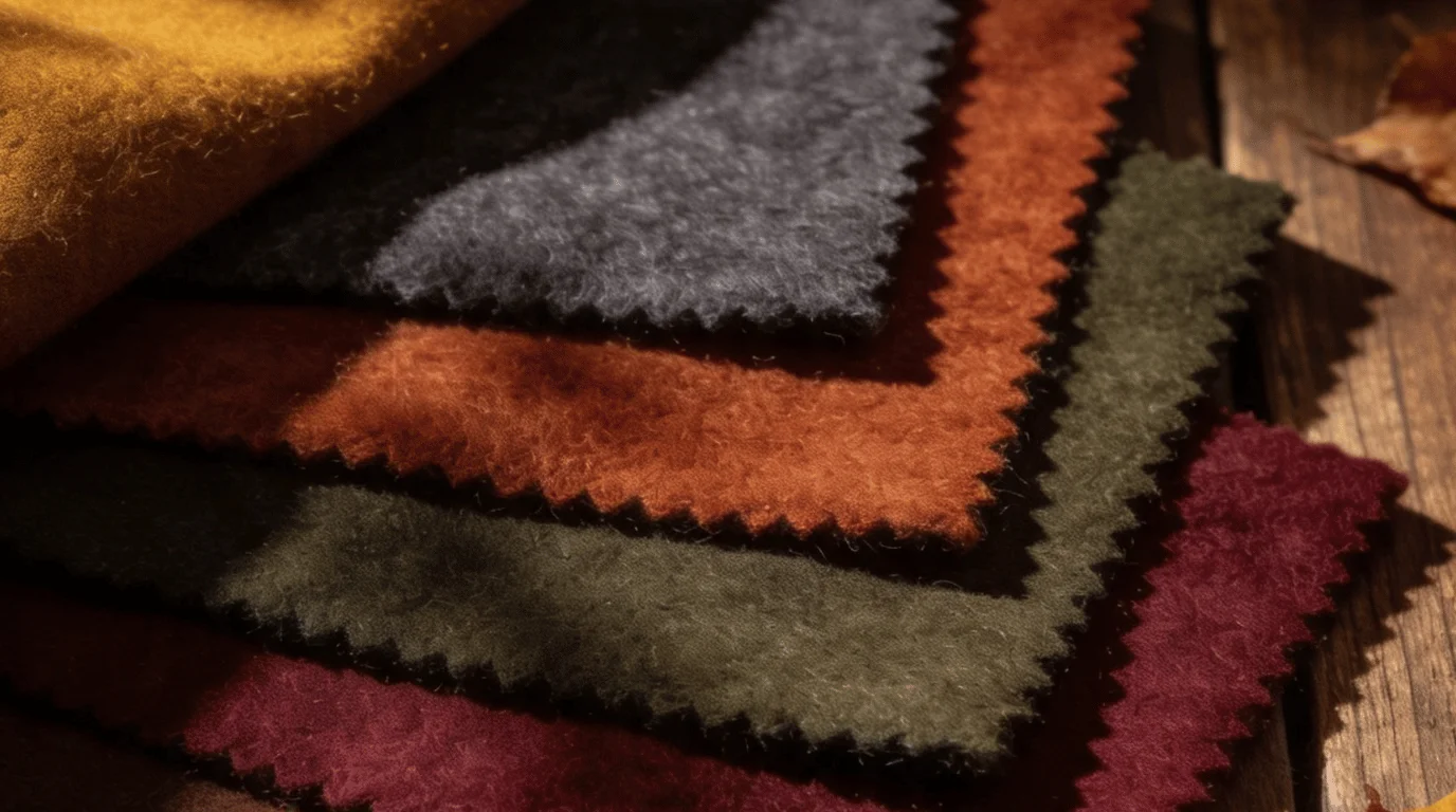
The dark autumn palette centers on deep, warm, slightly muted colors. Think espresso, dark olive, rust, oxblood, deep teal, warm aubergine, and antique gold. Build outfits from rich neutrals first, then add one or two saturated accents. Pale icy pastels and cool grays usually create the least harmony.
| Quick guide | Easy starting point |
|---|---|
| Dominant quality | Deep |
| Secondary quality | Warm to neutral-warm |
| Useful neutrals | Espresso, chocolate, camel, warm charcoal, cream |
| Strong accents | Rust, oxblood, olive, forest green, deep teal, warm aubergine |
| Metals | Gold, bronze, copper, aged brass |
| Often difficult | Icy blue, cool lilac, pale gray, optic white, neon brights |
| Neighboring seasons | True Autumn and Dark Winter |
Key Takeaways
- Choose depth before brightness.
- Replace stark black near your face with espresso or black-brown.
- Build outfits from two rich neutrals and one accent.
- Test colors in daylight instead of relying on hair or eye color.
- Keep makeup warm, deep, and connected to your clothing palette.
Dark Autumn Color Palette at a Glance
The easiest wardrobe anchors are espresso, dark chocolate, warm charcoal, camel, and cream. These shades create depth without the icy effect of blue-gray neutrals. They also make saturated accents easier to repeat across casual and polished outfits.
Use the dark autumn color palette as a family, not a rigid paint chart. Exact hex values vary among analysts and screens, so treat digital swatches as references. Fabric texture, lighting, and finish can change how one shade reads beside your face.
| Color role | Shade | Sample hex | Where it works |
|---|---|---|---|
| Deep neutral | Espresso | #2F211A | Coats, pants, boots |
| Deep neutral | Dark chocolate | #4A2C1D | Jackets, bags, knitwear |
| Light neutral | Warm sand | #E8D4B0 | Shirts, sweaters, summer pieces |
| Warm accent | Golden ochre | #C78319 | Knits, scarves, accessories |
| Warm accent | Burnt orange | #B24A24 | Tops, dresses, lipstick direction |
| Red accent | Brick red | #8E2F27 | Dresses, shoes, bags |
| Green accent | Deep olive | #4F5426 | Pants, outerwear, sweaters |
| Green accent | Forest moss | #354C2F | Coats, bags, boots |
| Blue-green accent | Deep teal | #155F4E | Blouses, dresses, jewelry accents |
| Purple-brown accent | Aubergine brown | #4B2E3A | Evening tops, nails, accessories |
| Metal direction | Antique gold | #8A6A2A | Jewelry, buckles, hardware |
How to Tell Whether This Season Fits You
Start with fabric draping in indirect daylight. Compare espresso with true black, then compare rust with cool berry. Notice whether your face looks clearer, more even, and more defined beside the warmer options.
Do not type yourself from one feature. Dark hair does not automatically place you in a deep season. Warm skin also does not guarantee an Autumn result, because olive and neutral undertones can complicate quick visual guesses.
A useful test compares depth first, then temperature. If pale colors overpower you, deeper colors may be important. If espresso and olive beat black and blue-red, the warm, deep family becomes more plausible.
Build a Wardrobe Around Rich Neutrals
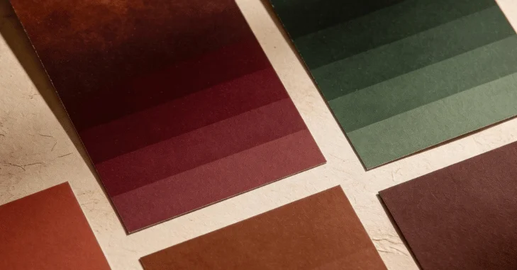
Start with the pieces you wear most often. Choose espresso pants, a chocolate jacket, cream knitwear, and deep olive outerwear before buying statement colors. That base gives rust, teal, oxblood, and aubergine somewhere calm to land.
Black can still stay in your closet. Move it away from your face through shoes, belts, bags, or lower-body pieces. Near your face, black-brown or warm charcoal often creates a softer transition.
For U.S. fall weather, color should stay consistent while fabric weight changes. A warm sand tank can work in September and layer under chocolate knitwear later. Styleblor’s Acubi Fashion Guide can help you match those layers to changing temperatures.
Outfit Color Formulas That Are Easy to Repeat
Strong outfits usually use one deep neutral, one supporting neutral, and one accent. This approach keeps the palette rich without making every piece compete. It also works across denim, tailoring, dresses, and casual weekend clothing.
Try these formulas.
- Espresso + cream + deep teal.
- Chocolate + camel + rust.
- Deep olive + warm sand + oxblood.
- Warm charcoal + cognac + forest green.
- Cream + dark denim + aubergine.
- Chocolate + antique gold + brick red.
Dresses can use the same logic with fewer pieces. A rust midi works with chocolate boots and antique-gold jewelry. Styleblor’s Light Academia guide offers practical layering ideas by temperature. The Pant Suits for Women guide also covers deeper red footwear pairings.
Makeup, Hair, and Jewelry
Makeup works best when it repeats the same warm depth as your clothing. Look for brick, terracotta, warm berry, brown-red, bronze, and deep olive families. Avoid turning every product orange, because balance matters more than obvious warmth.
For eyes, bronze, olive, warm taupe, espresso, and muted gold are easy starting points. Lips can move from spiced nude to brick, oxblood, or brown-berry. Blush usually looks more connected when it leans terracotta, cinnamon, or muted warm rose.
Hair changes deserve more caution than clothing changes. Rich brunette, chestnut, warm black-brown, and deep auburn colors can support this palette. Large changes may reduce the depth that makes the season work.
Gold, bronze, copper, and aged brass usually echo the palette naturally. Silver is not automatically forbidden, especially in mixed-metal outfits. Styleblor’s Baggy Clothes guide adds pairing ideas for warm footwear.
Colors That Commonly Fight the Palette
The hardest shades are usually pale and cool at the same time. Icy blue, cool lilac, powder pink, pale silver-gray, and optic white can create too much temperature contrast. Neon colors can also look disconnected because their brightness outruns the palette’s depth.
You do not need to throw those colors away. Move them farther from your face or pair them with warmer, deeper pieces. An icy bag is easier than an icy blouse, and a cool print can work inside a mostly warm outfit.
When replacing a difficult shade, keep the function and change the temperature. Swap optic white for cream, pale gray for warm charcoal, and baby blue for deep teal. Replace cool pink with brick rose or warm berry.
Dark Autumn vs. Dark Winter and True Autumn
Dark Autumn and Dark Winter both handle substantial depth, so they are easy to confuse. The main difference is temperature, with Winter leaning cooler and clearer. True Autumn keeps the warmth but usually carries less darkness.
| Comparison | This season | Dark Winter | True Autumn |
|---|---|---|---|
| Main quality | Deep | Deep | Warm |
| Temperature | Warm to neutral-warm | Cool to neutral-cool | Warm |
| Typical neutral | Espresso | Black | Camel |
| Easy red | Brick or oxblood | Blue-red or cranberry | Tomato or rust |
| Easy green | Olive or forest | Pine or emerald | Moss or leaf green |
| Light shade | Warm cream | Icy light | Golden beige |
If you are stuck between two seasons, compare fabric pairs instead of comparing labels. Espresso versus black can separate warm depth from cool depth. Deep rust versus pumpkin can help separate the deeper Autumn family from a warmer, lighter one.
A 10-Piece Starter Capsule
You can test the palette without replacing your wardrobe. Pick ten repeatable pieces and wear them in several combinations first. This shows whether the colors help before you spend more money.
- Espresso trousers
- Dark chocolate jacket
- Cream knit top
- Warm sand tee
- Deep olive overshirt
- Rust sweater
- Deep teal blouse
- Dark denim
- Brown ankle boots
- Oxblood or cognac bag
A capsule should fit your real climate and schedule. Someone in Florida may need lighter fabrics than someone in Minnesota. The colors can stay consistent even when the materials change completely.
FAQ
Is Deep Autumn the same as Dark Autumn?
Yes, the names usually describe the same season in 12-season systems. Different color-analysis schools prefer different labels. The shared idea is deep coloring with a warm or neutral-warm direction.
Can this season wear black?
Yes, but placement can matter. Black trousers, shoes, belts, and bags are usually easier than a black turtleneck. Espresso or black-brown often creates a warmer frame near the face.
What colors are in the dark autumn color palette?
Common colors include espresso, chocolate, rust, deep olive, forest green, oxblood, deep teal, and warm aubergine. Warm cream, camel, and cognac provide lighter support. Gold, bronze, and copper are useful metallic accents.
What makeup colors suit this palette?
Brick, terracotta, warm berry, bronze, olive, espresso, and muted gold are dependable families. Choose depth that matches your natural contrast. Test lipstick and blush in daylight before committing to a full look.
What colors should I avoid?
Pale icy colors are the most common problem area. Cool lavender, powder blue, silver-gray, and optic white can feel disconnected. If you love them, use smaller accents or place them farther from your face.
Your Next Step
Pull five warm deep items and five cool or pale items from your closet. Compare them near your face in daylight, then photograph both groups without filters. Keep the colors that make your features look clearer, and use that evidence before buying anything new.