
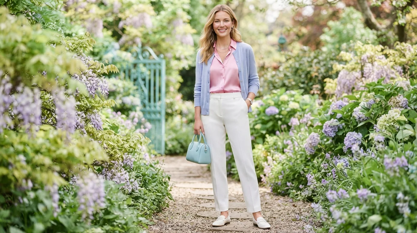
A cool spring color palette combines Spring freshness with a more neutral or cool color direction. Think clear pink, aqua, mint, periwinkle, lilac, and light neutrals instead of golden orange or mustard. The label varies between color-analysis systems, so identifying the system matters before buying a new wardrobe. You might also like How Long Does Builder Gel Last.
Quick answer: Cool Spring usually describes light, clear coloring that sits near the Spring-Summer border. The best shades are fresh rather than dusty, with pink, aqua, mint, periwinkle, clear blue, and lilac leading the palette. Avoid muddy earth tones and excessively dark colors near your face.
Cool Spring at a Glance
| Feature | Best Direction |
|---|---|
| Temperature | Neutral-cool to slightly warm |
| Value | Light to medium |
| Chroma | Clear and fresh |
| Contrast | Low to medium |
| Best pinks | Clear pink, watermelon, cool coral |
| Best blues | Aqua, sky blue, periwinkle |
| Best greens | Mint, turquoise, fresh blue-green |
| Best purples | Lilac, light violet |
| Best neutrals | Soft white, light navy, dove gray, cool beige |
| Metals | Silver, white gold, mixed metals |
| Colors to limit | Rust, mustard, dark olive, muddy brown |
Key Takeaways
- The term varies across seasonal color-analysis systems.
- Twelve-season systems usually place similar coloring near Light Spring or Light Summer.
- Some expanded systems use Cool Spring as its own crossover category.
- Clear, light colors work better than dusty, gray, or earthy shades.
- Pink, aqua, mint, periwinkle, turquoise, and lilac form the strongest color families.
- You can test the palette before replacing anything in your closet.
Is Cool Spring a Real Color Season?
The answer depends on the color-analysis system you follow. Standard 12-season systems usually divide Spring into Light, True or Warm, and Bright Spring. In those systems, every Spring subtype retains noticeable warmth.
Some expanded 16-season systems add crossover categories between the familiar twelve seasons. One such model describes Cool Spring as Spring shifted toward Summer. That produces lighter, clearer colors with less golden warmth.
This difference explains why online palettes sometimes contradict each other. One analyst may redirect you toward Light Spring or Light Summer. Another may use the crossover label while describing almost identical coloring.
The 18 Best Colors in a Cool Spring Color Palette

The strongest shades should feel light, clean, and lively. They need enough clarity to avoid looking dusty. They also need restraint because dark Winter intensity can overpower this coloring.
| Color | Sample Hex | Best Use |
|---|---|---|
| Clear pink | #F29BB2 | Tops, dresses, lipstick |
| Rose pink | #ED8FA6 | Blouses, scarves |
| Watermelon | #EC708C | Accent pieces |
| Cool coral | #EE8D8D | Tops, casual dresses |
| Clear aqua | #6FC7CF | Shirts, knitwear |
| Turquoise | #4FC2C1 | Dresses, jewelry |
| Sky blue | #86C7E8 | Shirts, denim alternatives |
| Periwinkle | #9EADE8 | Sweaters, dresses |
| Light cobalt | #6E91DB | Jackets, accessories |
| Mint | #9FDDC1 | Tops, cardigans |
| Seafoam | #A8D8CA | Casual separates |
| Blue-green | #68BFB3 | Dresses, swimwear |
| Clear lilac | #C3ACE3 | Knitwear, blouses |
| Light violet | #B6A0DA | Dresses, accessories |
| Soft white | #F7F5EE | Shirts, trousers |
| Dove gray | #C9CDD2 | Tailoring, basics |
| Cool beige | #DDD2C4 | Trousers, outerwear |
| Light navy | #4B6387 | Jackets, pants |
Hex values provide a useful visual reference, not a personal diagnosis. Fabric finish and lighting can shift how any shade appears. Compare real clothes against your face before treating a digital swatch as definitive.
How to Know Whether This Palette Suits You
Start with color behavior rather than hair or eye stereotypes. Your strongest shades should make your complexion appear clearer and more even. A useful color should not make shadows, redness, or dullness look stronger.
Try clear aqua against dusty blue in indirect daylight. Then compare fresh pink with muted mauve. If the cleaner colors consistently win, clarity may matter more than softness.
Next, compare warm peach with a cooler clear pink. Neither should overwhelm your face. A preference for the pinker option may place you closer to Summer than traditional Spring.
Professional color analysis can help when every comparison feels close. StyleBlor’s guide to working with an image consultant explains how color guidance fits into broader wardrobe planning. Image consultant guide
Cool Spring vs. Light Spring
Light Spring is generally warm, light, and fresh. Peach, warm pink, light turquoise, butter yellow, and creamy neutrals usually support it. The overall impression has more yellow and golden influence.
The crossover palette pulls several degrees cooler. Pink replaces some peach, while periwinkle becomes easier than golden yellow. Neutrals can shift toward dove gray, soft white, and balanced beige.
Try both palettes before choosing a label. Wear the warm peach one day and the clear pink another. The better shade should leave your face looking more balanced without requiring extra makeup.
Cool Spring vs. Light Summer
Light Summer creates the most common point of confusion. Both directions favor lighter colors and avoid heavy darkness. Their biggest difference is usually clarity versus softness.
Light Summer typically tolerates grayer, smokier colors. Dusty rose, powder blue, soft lavender, and blue-gray can look harmonious. The Spring-side crossover needs colors that look cleaner and slightly brighter.
Compare mint with muted sage for an easy test. Mint supports the clearer side, while smoky sage favors Summer softness. Repeat the comparison with clear pink and dusty rose before drawing conclusions.
Best Neutrals for an Easy Wardrobe
Black can feel heavy beside these lighter colors. Softer neutrals usually connect more naturally with the palette. They also make brighter accents easier to repeat.
Build around soft white, oyster, dove gray, cool beige, light taupe, denim blue, and softened navy. Choose two or three for pants, coats, shoes, and bags. Then use clearer colors near your face.
StyleBlor’s guide to pastel outfits shows how pale colors can work with structured neutrals. The same approach works here. Clean silhouettes keep light shades from feeling overly sweet.
Five Easy Outfit Formulas
You do not need matching seasonal colors from head to toe. One strong shade near your face can do most of the visual work. Keep the remaining pieces familiar and wearable.
- Clear aqua shirt + light denim + soft white sneakers.
- Periwinkle sweater + dove-gray trousers + silver jewelry.
- Clear pink blouse + light navy pants + taupe loafers.
- Mint cardigan + soft white tee + medium-wash jeans.
- Lilac dress + cool beige shoes + silver accessories.
These formulas also make testing cheaper. Start with tops, scarves, or inexpensive knitwear before buying coats. You will learn which color families deserve more space in your closet.
Makeup and Jewelry Colors
Makeup should echo the palette without becoming icy. Look for fresh pink blush, rose-pink lipstick, cool coral, and light neutral eye colors. Heavy brown, orange-red, and brick shades may feel disconnected.
Silver and white gold are straightforward choices when cooler shades clearly flatter you. Mixed metals can work well for balanced or neutral coloring. Bright yellow gold may still work when your skin retains noticeable warmth.
Treat metal rules as testing prompts instead of laws. Hold silver and gold beside your face in the same light. Choose the metal that makes your skin appear calmer and clearer.
Colors to Avoid or Move Away From Your Face
Muddy colors are often harder than bright ones. Deep rust, mustard, swampy olive, murky brown, and gray-beige can suppress the palette’s freshness. Large areas of black can also create excessive contrast.
That does not mean every difficult color must leave your closet. Move it into shoes, trousers, belts, or bags. Place one reliable palette color between that item and your face.
The contrast becomes especially clear beside deeper seasonal palettes. StyleBlor’s Dark Autumn color palette guide shows how dramatically warmer, deeper colors behave. Comparing the two can make your own direction easier to see.
Can You Wear Butter Yellow?
Yellow is where the terminology becomes complicated. Traditional Spring palettes usually handle warm yellows beautifully. A cooler crossover may need a paler or cleaner version.
Try light primrose, cool lemon, or pale creamy yellow before mustard or golden ochre. Compare each color directly against your face. A yellow that creates sallowness is too warm or muddy for you.
StyleBlor’s butter yellow dress guide explains how butter, lemon, pastel yellow, and cream behave differently. Those differences matter when shopping online. Two dresses labeled yellow can create opposite effects.
How to Build a Small Starter Capsule
Start with clothes you already own before buying anything new. Photograph your strongest combinations in consistent daylight. Patterns become much easier to spot after several outfits.
Choose two neutral bottoms, two light neutral tops, and three colored tops. Add one cardigan or jacket in navy, gray, or blue-green. Finish with shoes you already wear regularly.
Your first capsule might use soft white, denim, dove gray, aqua, pink, mint, and periwinkle. Those colors create plenty of combinations without forcing exact matches. Replace pieces only when repeated testing shows a clear benefit.
Frequently Asked Questions
What is a cool spring color palette?
A cool spring color palette is a light, clear palette that leans closer to Summer than classic warm Spring. The term appears most often in expanded color-analysis systems. Its strongest shades include clear pink, aqua, mint, periwinkle, turquoise, lilac, and light neutrals.
Is Cool Spring the same as Light Spring?
Not exactly, although the categories can overlap between systems. Light Spring normally keeps more peach, gold, and yellow warmth. The cooler crossover favors pinker, bluer, and more neutral versions of light colors.
Can Cool Spring wear black?
Black may create more contrast than this palette needs. Try softened navy, charcoal-blue, or medium gray near your face instead. Keep black for shoes, bags, or bottoms when you already own it.
Is Cool Spring warm or cool?
That answer depends on the system using the name. Expanded systems often describe it as neutral-cool or Spring leaning toward Summer. Traditional 12-season systems usually would not call a truly cool person Spring.
What hair colors suit this palette?
Balanced blonde, beige blonde, neutral light brown, and gently cool brown are reasonable starting points. Avoid choosing hair color from a seasonal label alone. Your natural depth, undertone, and maintenance needs matter equally.
What colors should I test first?
Start with clear aqua, fresh pink, mint, periwinkle, and soft white. Compare each against a warmer or dustier alternative. Repeated side-by-side testing gives more useful information than judging one color alone.
Build Around the Colors That Prove Themselves
Seasonal color analysis should make dressing easier, not create another set of rigid rules. Use the label to organize experiments with color. Keep the shades that consistently make you look rested and balanced.
Start with five colors and two neutrals instead of replacing your wardrobe. Photograph outfits in similar daylight for several weeks. The strongest pattern will become clearer through repetition.
Once you know your reliable shades, build outfits around them rather than chasing a perfect category name. StyleBlor already covers practical color dressing through guides on pastels, seasonal palettes, and personal styling. Use those resources to turn your palette into clothes you will wear.